


Jul 23, 2015
Here is how to show two different types of information on the same chart; especially if the two types of information are on different scales (one set of information is a lot bigger or smaller than the other).
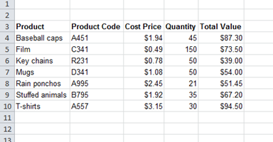
Here is some data and let’s say I want to show both the Cost Price and the Total Value on a single chart. Notice the Cost Price goes from zero to around $3, and the Total Value goes from zero to around $90.
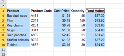
I’ll select these areas and make a standard clustered column chart out of the selection:
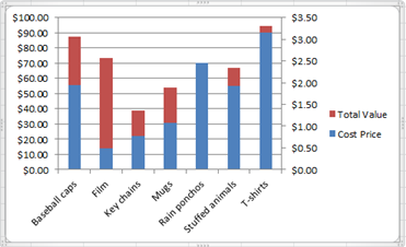
Here is the chart:
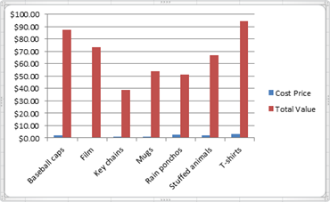
As you can see it is case of ‘mountains’ and ‘molehills’, the Cost Price is really hard to see because it is so small.
To solve this problem you can click on one of the blue towers to select the series of data, then right click on one of the blue towers and choose Format Data Series from the bottom of the right click menu.
I’m using Microsoft Office 2010 here so the menu looks like this (it looks reasonably similar in other versions of Office):
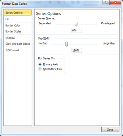
Putting the dot in the option for Secondary Axis means that this series of data (the blue towers) are going to have their own axis. Basically the primary axis is on the left hand side of the chart and secondary axis is on the right hand side.
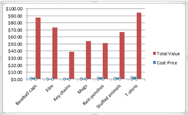
Looking at the chart you can see the axis scale on the left hand side is zero to $100, the axis scale in the right hand side is zero to $3.50.
Note: you can only have two axes, because there are only two sides to put the scales on.
The only remaining problem is that the blue towers now cover the red towers making it difficult to see all the red towers.
The easy solution to this is to select the blue towers again and then right click on a blue tower. The right click menu has an option called Change Series Chart Type…
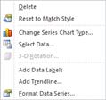
When we choose this, we can change the type of chart that the blue towers are from a column chart to a line chart, which makes it easy to see both series of data.
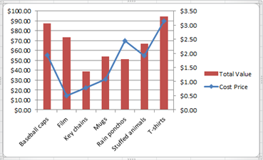
And there we are, we can now compare the two different types of information in the same chart!
How do your Excel skills stack up?
Test NowRelated Articles


About the Author:
Matthew Goodall

Matthew is a qualified Microsoft Office Specialist, Microsoft Certified Applications Specialist and a Microsoft Certified Trainer with over 11 years of hands-on experience in a training facilitation role. He is one of New Horizons most dynamic instructors who consistently receives high feedback scores from students. Matt enjoys helping students achieve real professional and personal growth through the courses he delivers. He is best known for creating “fans” of students, who regularly request him as an instructor for any future courses they undertake at New Horizons.
Read full bio


Next up:
- Create Documents Archive Repository in SharePoint 2013
- Unlinking A Pivot Table From Its Source Data
- Connector Enhancements in Office 365
- Good news…about delivering bad news!
- Introducing Windows 10!
- Excel – Fill in the Blanks
- Easily Create Complex Illustrations with Basic Tools and Pathfinder Commands in Adobe Illustrator
- The Many Flavours of Windows 10
- When it's not harassment
- "Hey, Cortana"
Previously
- Extroverts versus Introverts; does it matter?
- Visual creation of a Microsoft Azure SQL Database.
- Adobe Acrobat Custom Stamps
- Introducing PowerShell for Office 365!
- Recording Screen Action in PowerPoint 2013
- What Sort of Leader are You?
- Creating a storage account and container in Windows Azure
- Selecting Text in Microsoft Word
- Implementing live tiles in a Windows Store App
- Using conditional formatting to highlight weekend dates in Excel
