Charts that aren’t charts

 Nov 14, 2014

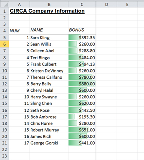
In Microsoft Excel, there are a couple of ways to create a ‘chart that isn’t a chart.’ Each produces a graphical representation of data, but using different techniques. 1. Use Conditional Formatting If you have a range of numbers and you want a quick and easy graphic bar chart-like view of that information using data bars conditional formatting;
  1. Select the numbers you want to work with. You don’t have to select the headings.
  2. Then in the ‘Home’ tab, click on ‘Conditional Formatting – Data Bars’ and choose the colour of data bar you would like. I recommend choosing a lighter colour so that you can still read the number itself.
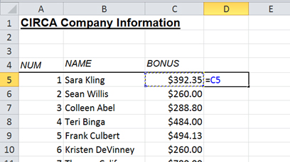
I also prefer the solid fills as opposed to the gradiated fills, but that’s a personal choice. If you prefer to have the data bars in separate cells to the numbers, you can create a simple  formula that is equal to the cell to the like this;

charts-not-charts-3

 
  1. Copying that formula down, then applying the same conditional format to the cells in column D.
  2. Then go to ‘Conditional Formatting – Manage Rules’ and choose the rule – ‘Edit Rule’.
  3. Tick box for ‘Show Bar Only’.
The result should look like this, ‘a chart that isn’t a chart!’

charts-not-charts-2

To get rid of the conditional formats, simply select the area with the conditional format on it and then go: Conditional Formatting – Clear Rules – Clear Rules from Selected Cells… 2. Use a Sparkline If you want a ‘ticker’ line or lines displaying a visual of a set of figures, then a sparkline can do a good job of this.
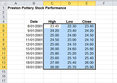
  1. Select the numbers you want to work with. You don’t need to select the headings and you can choose more than one row or column of data if you want to.charts-not-charts-6
  2. On the ‘Insert’ tab click in the sparklines group click on the type of sparkline that you want.
  3. Excel will then bring up a menu asking for the Location Range (the area where you want to see the sparklines).
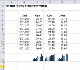
For this example I’m going to choose three cells below directly below the data.

charts-not-charts-7

You can see the results. I’ve chosen to do a column sparkline, but you can change this to another type of sparkline (Line or Win/loss) after it is created. You will notice that when you have the selection on the sparkline’s cells, than there is an extra contextual tab coloured yellow called ‘Sparkline Tools – Design’ on the right hand side of the ribbon. From here you can change the type of sparkline, the colour and mark high and low points on the sparkline. You can also use the Edit Data button on the left hand side to change the data area for a sparkline. Here is an example of some changes I’ve made to the sparkline.

charts-not-charts-8

Note: with sparklines the bottom of the cell is a lowest values (in my example above around 22-23) and the top of the cell is the largest value (for the example around 26-27). This is fine for this sparkline, because I’m interested in easily seeing small changes in this stock’s price. However for data where you want to see things on a proportional scale you will need to make the following adjustment. How do I make the bottom of a Sparkline zero? Here is an example of data that I want to see proportionally:

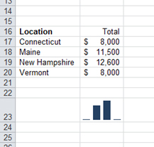
charts-not-charts-9

Notice that the two 8,000 values are right at the bottom of the cell, making it hard to see how each number compares to the others. In the Design contextual tab;
  1. Click on Axis and choose Custom Value for the Vertical Axis Minimum Value Option.
  2. Make sure it is set to zero and click on Ok.
Now the spark line is proportional. To remove a spark line, either right click and choose Delete, or choose the Clear button on the right hand end of the Design tab. Note: pressing the delete key on the keyboard won’t get rid of a spark line, because the spark line isn’t in the cell as data, it’s there as the background of the cell (you can actually type data in a cell that contains a sparkline, it just doesn’t look very good). So there you have it: two ways to visually present data in Excel that aren’t a chart!

How do your Excel skills stack up?   

Test Now  

About the Author:

Matthew Goodall  

Matthew is a qualified Microsoft Office Specialist, Microsoft Certified Applications Specialist and a Microsoft Certified Trainer with over 11 years of hands-on experience in a training facilitation role. He is one of New Horizons most dynamic instructors who consistently receives high feedback scores from students. Matt enjoys helping students achieve real professional and personal growth through the courses he delivers. He is best known for creating “fans” of students, who regularly request him as an instructor for any future courses they undertake at New Horizons.

Read full bio
top